
Qatar Tourism Authority
Repositioning and a refreshed identity for the organisation responsible for selling Qatar to the world.
The Why
What happens when a country moves faster than its brand?
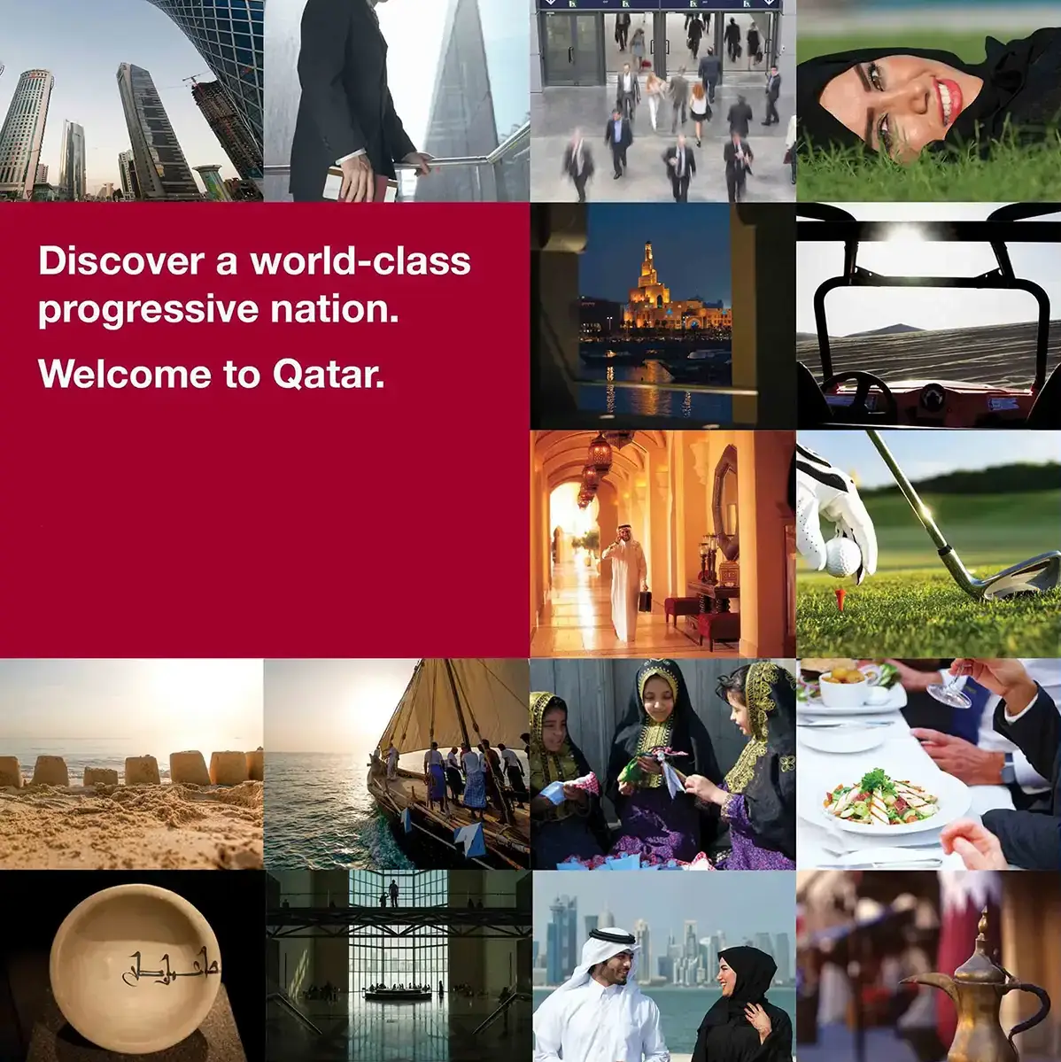
In 2013 Qatar was changing at a remarkable pace. There was infrastructure going in everywhere you looked, world class sport and international conferences arriving, and a leadership with a very clear idea of where the country was heading. The organisation responsible for telling the rest of the world about all that was still presenting itself the way it always had.
Qatar Tourism Authority could see the problem as clearly as anyone. Around 1.3 million people visited that year, which sounds like a lot until you look across the border. Dubai’s hotels alone were reporting something like eleven million guests. Next to the competition, the QTA’s brand looked dated. It was also being asked to carry far more than holidays: sport, conferences and exhibitions, business travel, culture and heritage, all under one name.
A new logo on its own wasn’t going to fix that. What they needed first was a clear idea of what Qatar should stand for, something solid to build on while the country caught up with its own ambitions.
Definition
Moving forward, with its roots showing
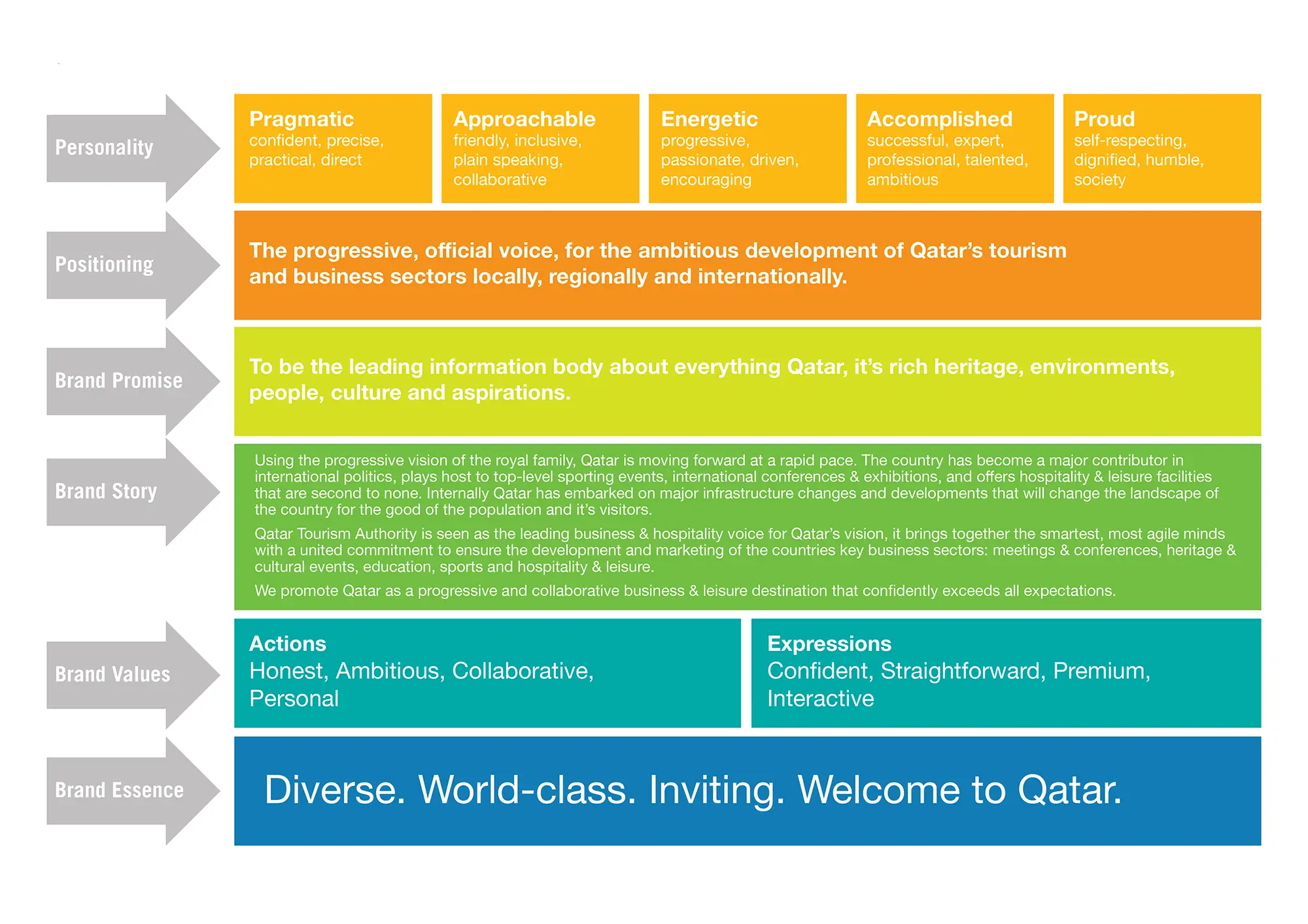
This was Phase One of a bigger programme, and it started with listening. I spent time with the QTA’s senior team, working through where they stood, where they wanted to get to, who they were really up against and what Qatar actually had to offer. That turned out to be a good deal more than most outsiders realised.
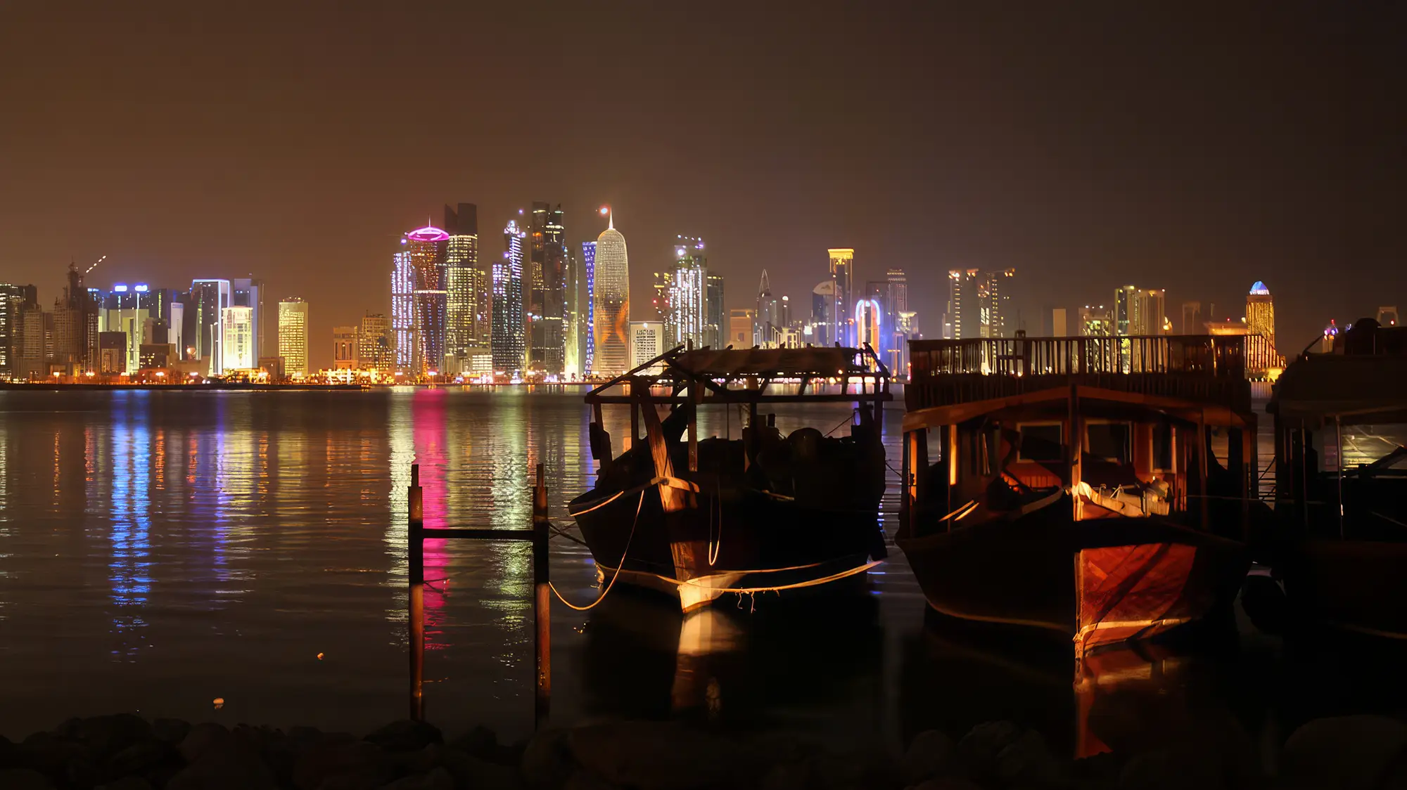
The story that came out of it was progress and heritage, side by side. A country moving fast, hosting major sport and international events and building at an extraordinary rate, but doing it from deep cultural roots rather than a blank sheet. Getting that balance right mattered. Lean too far towards the shiny and new and Qatar would blend into a region full of new skylines. Lean too far towards heritage and it would undersell what was actually happening.
From that came a brand platform and a roadmap, deliberately built to be added to as things changed rather than fixed in place. Given how quickly the country was moving, that was the only kind worth building.
Experience
One brand, two very different jobs
The logo was a refresh, not a redesign. The symbol stayed much as it was, with new typography around it to bring it up to date. People already recognised it, and there was no reason to throw that away.
The bigger piece of thinking was the visual language around it. The QTA had to talk to two very different audiences. One was the corporate world of conference organisers, investors and business travellers. The other was the much louder world of festivals, sport and family days out. One look couldn’t serve both without going flat for one or too loud for the other. So the system was built in two tiers, a corporate layer and an events layer, clearly part of the same family but each free to behave the way its audience needed.
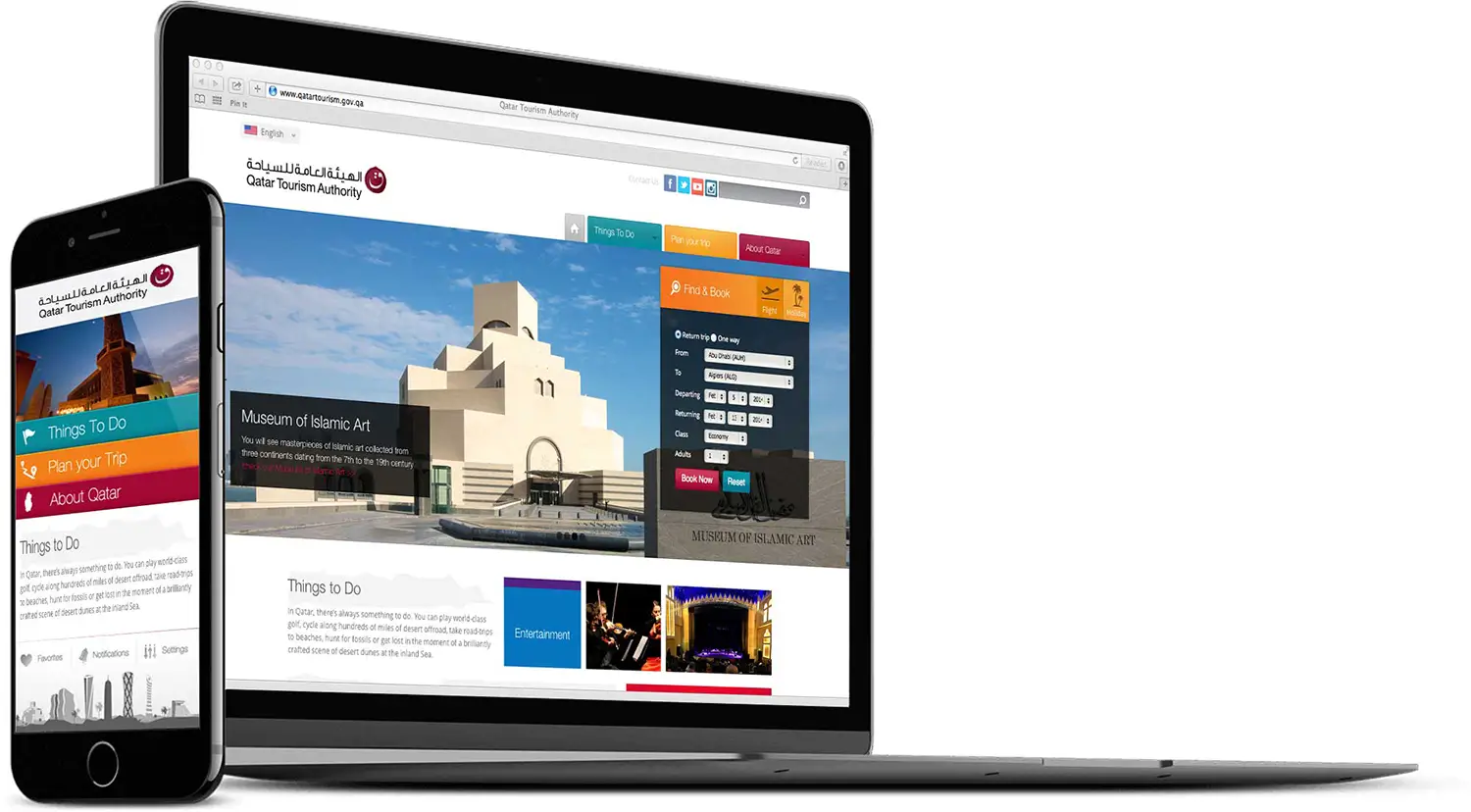
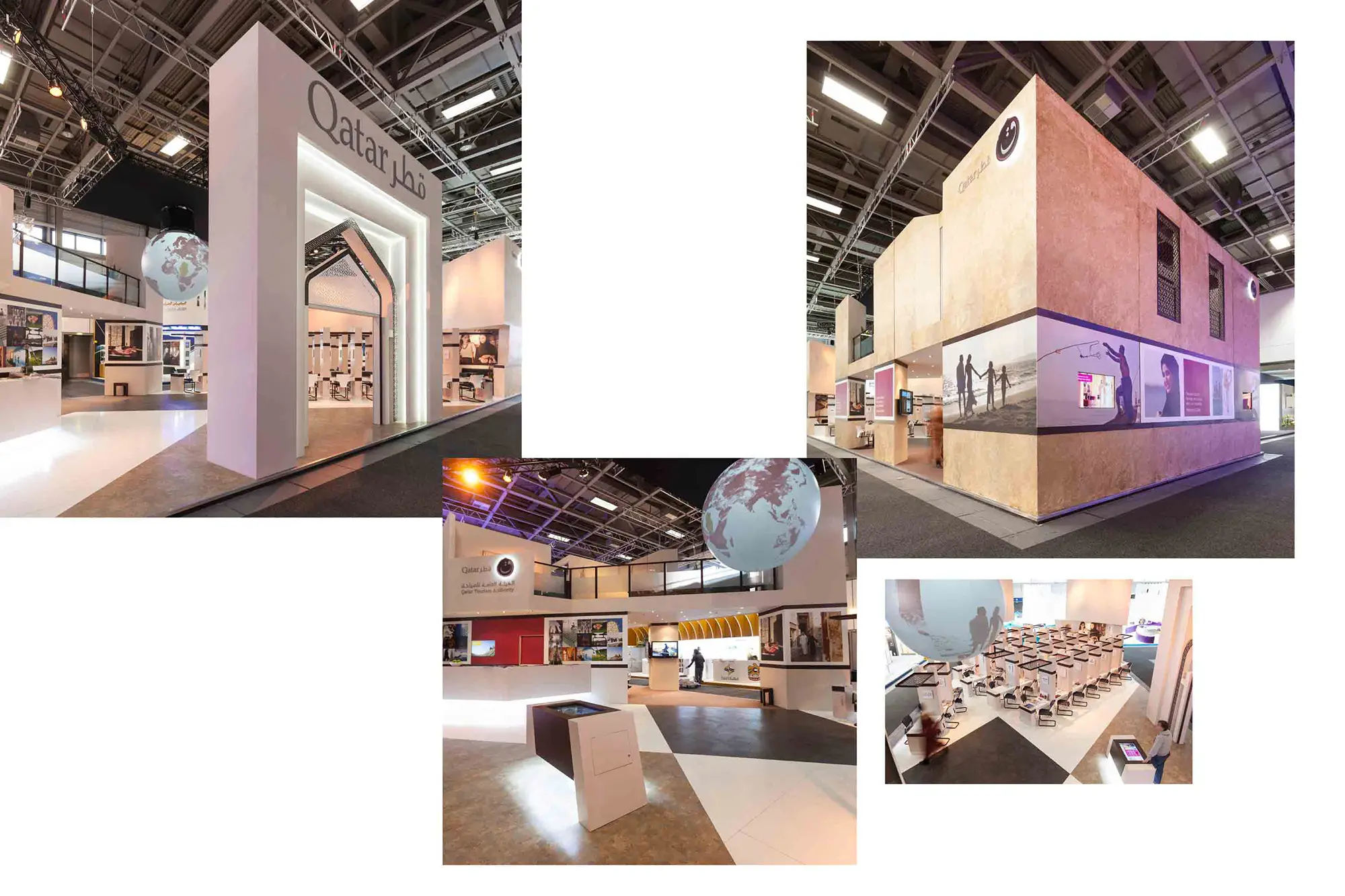
It worked in Arabic and English throughout. All of it was creative direction, showing how the brand should look in advertising, publications and on a website, so anyone picking it up could see exactly what to aim for before they’d made anything. Alongside that, I created the graphics for two of the QTA’s international exhibition stands, along with a few outdoor and press adverts. That’s where the system first had to stand up in public.


Implementation
Written down so others could run with it
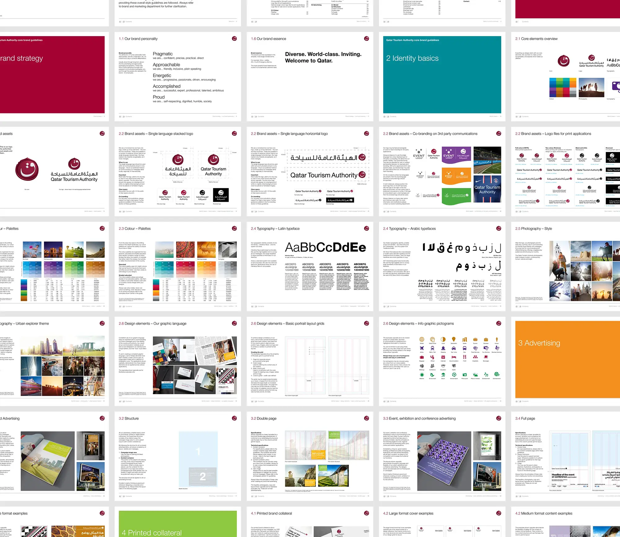
Much of a tourism authority’s marketing is made by agencies rather than in house, and the brand has to survive all those hands. So everything was documented in a full set of brand guidelines, written for the QTA’s own team and for every agency they’d hand a brief to, so it would look like itself wherever it turned up.
That’s really the point of a first phase. You lay down something solid enough that whatever comes next has a clear place to start. Phase Two went to others, and some of what was put in place here carried through into it, which is about as much as any first phase can hope for.
Looking back, it was the start of something bigger for me too. It came through someone I’d worked with in Doha, the first project they sent my way after we’d both moved on, and that relationship carried on to Cairo and eventually to the Pyramids of Giza.


2013
5+
~1.3M
~5.1M
Deliverables are the brand strategy, creative direction and guidelines, graphics for two international exhibition stands, and a handful of outdoor and press adverts. Visitor figures are national totals, from the QTA’s own 2013 figures and Qatar Tourism’s 2025 results. They show how far the destination has come since this early groundwork, with a great deal else in between, rather than the effect of any one project.
“It’s odd looking back at this one, knowing what came next. At the time it felt like a big brief. It turned out to be the very start of something much bigger, for Qatar and for me.”
Has your brand fallen behind what you’ve become?
Let’s Chat
Most organisations outgrow their brand long before anyone notices. If yours belongs to an earlier version of you, let’s talk.